More workType design
Ritcher Typeface
Personal project
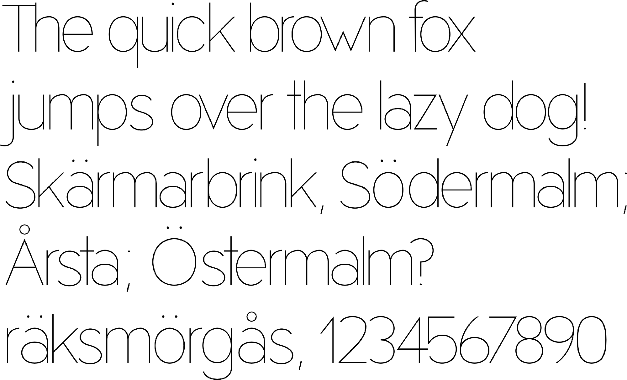
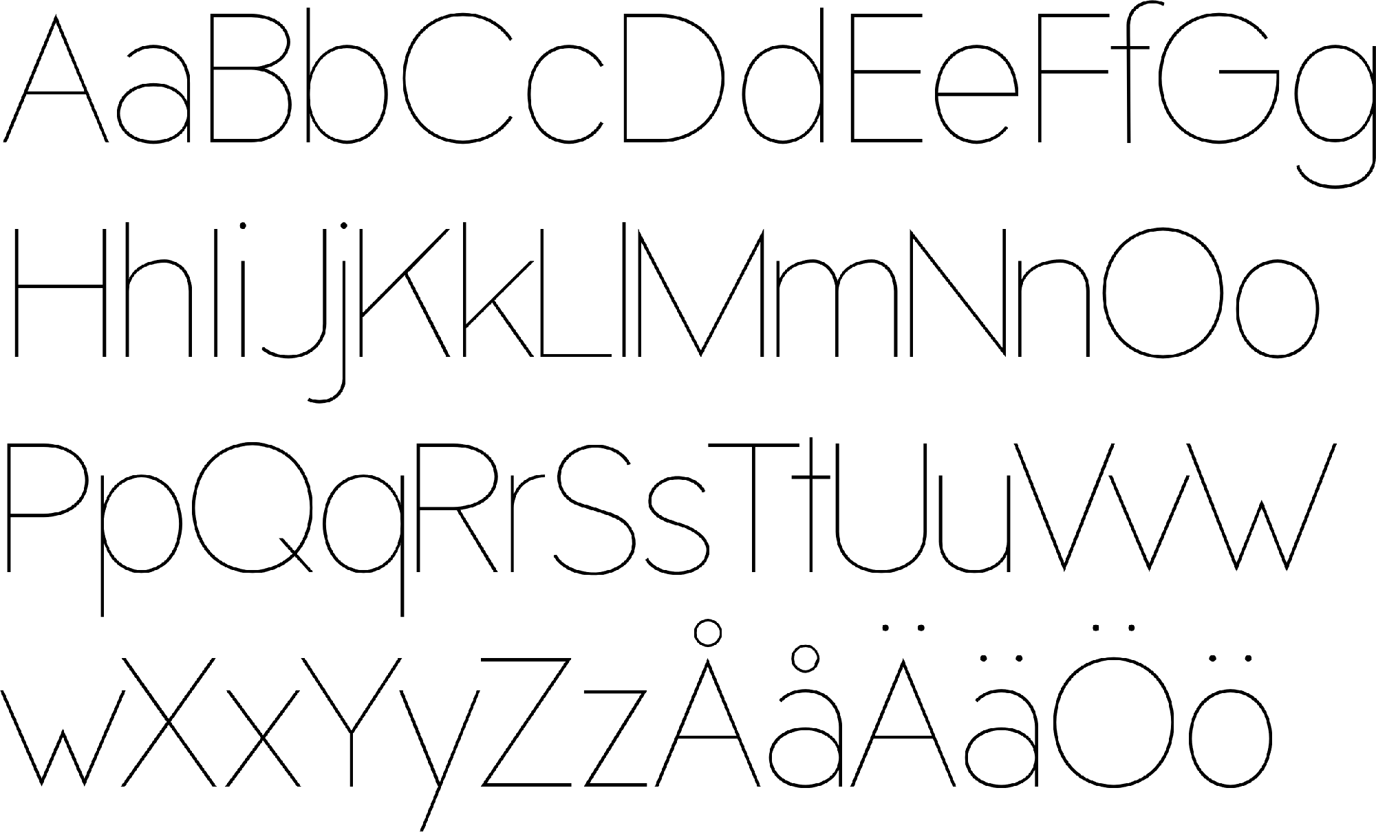
An ultra-light typeface for editorial use, designed to feel impactful and fragile at the same time.
The idea
My goal was a super thin, simple typeface with real presence. It has appeared in Bonnier Instagram videos, in K Composite, and in other client projects.
What I did
- Used a tall x-height to make it friendly.
- Drew big curves to leave plenty of open space inside the letters.
- Paired harsh straight stems with extra-sharp angles at the points.
Next
The typeface is a work in progress that I keep refining in my free time. Next up are kerning and tracking, and ligatures for pairs like “fi” and “fl”.
Credits
- Designer: Scott Ritcher